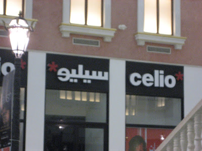
Here are some of the better examples of this phenomenon.


This sign is interesting for similar reasons:

As an English speaker, you probably think the logo says "DI". But it also says "دا" (dal alif), so the initialism works in both languages.
Thoughts about Torah, physics, politics, the independent Jewish scene, education, music, DC, and the intersections of all those areas. Contact: mahrabu at gmail dot com


as I recall, Israelis do the same thing.
ReplyDeleteLOL, i love the "Tide Blus" :-P
ReplyDeleteif i remember correctly, in "Metamagical Themas" there's a chapter about how fonts jump scripts between different languages.
Is this really a case of imitation of specific English fonts? It looks more like imitating well known brands' logos/trademarks.
ReplyDeleteThat would be Tide SUBER Blus!
ReplyDeleteI love the 'em in em miniz.' Curious how these random transliterations become new words in Arabic (and in all languages, thanks to globalization). I was curious--here's the origin of the candies: http://en.wikipedia.org/wiki/M%26M%27s
ReplyDelete